
Tuesday, March 2, 2010
This Is Potentially the Screwiest GDP Chart I've Ever Seen
Paul Krugman links to Mark Thoma who in turn cribs from the Federal Reserve Bank of San Fran to give us...

The definition of "potential GDP" comes from the San Fran bank:
Then, at no time whatsoever during the housing and stock market boom (except maybe a little blip in 2006) was actual GDP higher than potential. According to the CBO's calculation (which is where SF got the potential GDP number), the US economy in the year, say, 2005 was in a perfectly sustainable configuration. We could have repeated the experience of 2005 indefinitely, if only we had implemented the proper policies.
And now, of course, there is no reason for output to have fallen in the current recession. It's just that aww shucks aggregate demand collapsed for some nonsensical reason, and now we're stuck with a trillion dollars less in output per year than we ought to be enjoying.
There are two lessons from all this:
(1) Mainstream macroeconomists have a very very crude notion of the structure of production. Their models literally cannot handle the possibility that an unsustainable boom from 2002-2006 could have physically necessitated a drop in measured output from 2007-2008.
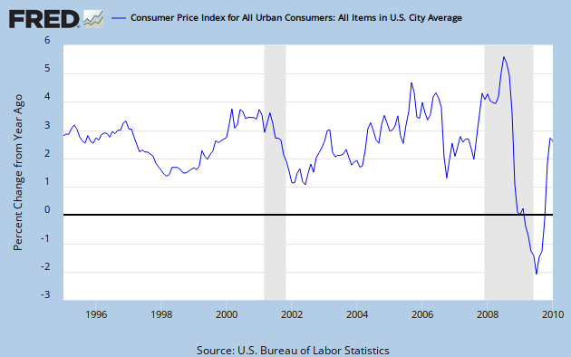
(2) As the persistent von Pepe keeps reminding me, the mainstream focus on CPI as the measure of "inflation" is wrong. As the chart above shows, people who think the economy is in great shape so long as CPI grows at a moderate pace can often fall flat on their faces.
The definition of "potential GDP" comes from the San Fran bank:
Potential output is not a measure of maximum output that can be achieved, but instead maximum sustainable output. As such, it is the level of real GDP that is consistent with stable inflation. When actual real GDP is running higher than potential GDP, the economy is said to be producing above full capacity.Now look back at that chart, to see if we like the implications of this typical macro way of looking at things. Actual GDP was higher than potential GDP during the recession of 2000-2001; isn't that a bit weird?
Then, at no time whatsoever during the housing and stock market boom (except maybe a little blip in 2006) was actual GDP higher than potential. According to the CBO's calculation (which is where SF got the potential GDP number), the US economy in the year, say, 2005 was in a perfectly sustainable configuration. We could have repeated the experience of 2005 indefinitely, if only we had implemented the proper policies.
And now, of course, there is no reason for output to have fallen in the current recession. It's just that aww shucks aggregate demand collapsed for some nonsensical reason, and now we're stuck with a trillion dollars less in output per year than we ought to be enjoying.
There are two lessons from all this:
(1) Mainstream macroeconomists have a very very crude notion of the structure of production. Their models literally cannot handle the possibility that an unsustainable boom from 2002-2006 could have physically necessitated a drop in measured output from 2007-2008.
(2) As the persistent von Pepe keeps reminding me, the mainstream focus on CPI as the measure of "inflation" is wrong. As the chart above shows, people who think the economy is in great shape so long as CPI grows at a moderate pace can often fall flat on their faces.
Comments:
Yeah, I saw this on his blog too. "Potential GDP" is something I had never heard of, to be honest. Of course, Krugman focuses on the the gap between the two lines, rather than the validity of the lines themselves. And comes up with his usual conclusion of more government interventio is required.
# posted by  : March 2, 2010 at 10:29 AM
: March 2, 2010 at 10:29 AM
I have always been amazed by the 'potential GDP' measure. Pure magic.
# posted by : March 2, 2010 at 10:51 AM
: March 2, 2010 at 10:51 AM
It should be clear by now that Keynesians and other mainstreamers simply do not have what can be called an economic theory. Whatever it is you might call their "ideas", they appear to view the charts and data (and not the living, breathing human beings) as the true reality. Thus, they are hunting for some statistical Nirvana where "sustainable inflation” will optimize "GDP". All other methodologies must be mocked and shunned. However, reality consists of the underlying actions of humans which the mainstreamers ignore.
Inflation results from money dilution by the central bank. People getting the new money first are in effect stealing purchasing power from those holding the old money but this is done in such a way that most people are oblivious to the theft. How can such a horrible system be “sustainable”? How could one possible study this phenomenon and ignore the immorality of it? Of course, this process will lead to malinvestments and the inevitable bust.
I am totally fascinated by the socio-pathologies of the Keynesians and mainstreamers who are vociferous in their ignoring of this reality.
# posted by : March 2, 2010 at 11:50 AM
: March 2, 2010 at 11:50 AM
According to the chart the economy was in an ideal spot before the near collapse of western civilization. All those greedy speculators and laissez-faire types must have arisen from their collective coma in 2008 to destroy the economy.
Macro texts usually discuss potential output but never really claim how one scientifically determines it...my guess is someone just looks at a chart of gdp, grabs a crayon, and draws a somewhat straight line through the middle.
Macro texts usually discuss potential output but never really claim how one scientifically determines it...my guess is someone just looks at a chart of gdp, grabs a crayon, and draws a somewhat straight line through the middle.
# posted by : March 2, 2010 at 11:54 AM
: March 2, 2010 at 11:54 AM
Heh this is funny. I was going to try to explain to you guys that there was a method to the CBO's madness, by looking at the yr/yr change in CPI. I was expecting to see price inflation higher in the 1999-2001 period than from 2003-2005, to explain why the CBO thought we had above-potential output in the former period but not the latter.
But as you can see from the graph, that wasn't the case. CPI inflation (at least as measured by backward-looking 12-month change) was kicking pretty good during the housing boom years, and really got going by the end.
So at this point the CBO's calculations really are a black box to me. Maybe they use "core" CPI with 3-month annualized growth rates or something. Who knows.

Hmm, all they have to do is makes sure that mud pie factories always increase about 2% of the economy, every year, so we always meet potential gdp, but never go over it. Then we will never need to have a recession, because we are at potential gdp, due to mud pie making.
# posted by : March 2, 2010 at 4:26 PM
: March 2, 2010 at 4:26 PM
What we need is an Onion type graph to mock this -- which reveals that it is build out of fairy dust and illusions existing only in the macreconomists mind.
According to the chart the economy was in an ideal spot before the near collapse of western civilization.
Where do you get the idea that the chart makes any such claim? In fact, how can any single measure, even a gross aggregate like GDP, define the ideal spot for the economy? What about poverty level, unemployment, wealth distribution, capacity utilization, interest rates, trade balance, productivity, physical plant, infrastructure . . . ?
I was expecting to see price inflation higher in the 1999-2001 period than from 2003-2005, to explain why the CBO thought we had above-potential output in the former period but not the latter.
Why? Real GDP is inflation adjusted, so isn't that washed out? Besides, the the graph is talking about output, not inflation levels, per se. And the comparison is to an abstraction, "stable inflation," not the actual cpi in the current year. Help me see your point.
my guess is someone just looks at a chart of gdp, grabs a crayon, and draws a somewhat straight line through the middle.
If you have a decent eye, you'll come pretty darn close to the best fit least squares regression line over the last 200 years. IIRC, the long term real growth rate is approx. 3.75%/year.
I suspect the potential line (though not exactly straight) is pretty darn close to the 200 year trend line. Be that as it may, if the comparison were to the trend line, rather than potential output, would it then make more sense, or be more digestible?
Cheers!
JzB
Robert,
You wrote:
"Then, at no time whatsoever during the housing and stock market boom (except maybe a little blip in 2006) was actual GDP higher than potential. According to the CBO's calculation (which is where SF got the potential GDP number), the US economy in the year, say, 2005 was in a perfectly sustainable configuration. We could have repeated the experience of 2005 indefinitely, if only we had implemented the proper policies."
I'm not an economist, but I've often seen the argument made that the housing bust alone wouldn't have been enough to produce a recession, so long as the Fed didn't let NGDP drop too much. Obviously, this is Sumner's view, and many others, such as Krugman, have commented that one problem with the Austrian approach is the asymmetry between the magnitude of bubbles and the macro severity of busts.
And when it comes to the various CPI numbers, aren't there plenty of alternatives, such as the GDP deflator, for example?
Where do you get the idea that the chart makes any such claim?
actual GDP = potential GDP is the ideal policy makers shoot for
In fact, how can any single measure, even a gross aggregate like GDP, define the ideal spot for the economy?
It can't, thus my sardonic commentary
I suspect the potential line (though not exactly straight) is pretty darn close to the 200 year trend line. Be that as it may, if the comparison were to the trend line, rather than potential output, would it then make more sense, or be more digestible?
How exactly is the potential GDP line formed? I've never seen it explained. Is it some amalgam of the factors-of-production?
Regardless of approach it appears to mimic an extension of a linear regression based on past data, which tells you almost nothing about the future. A facile line independent of the numerous un-quantifiable factors determining potential output is pointless.
# posted by : March 3, 2010 at 9:58 AM
: March 3, 2010 at 9:58 AM
Anon -
Sorry, your sardonic humor went over my head.
BTW, I made a careless mistake last night. The best fit straight line is based on ln(GDP), not GDP directly, since GDP growth over time is a curve. Silly me.
But - this line has been quite stable over a long time period - 200 years. It might seem pointless in the abstract, but, empirically, it does represent a norm for apparently sustainable long range growth. Deviations from the line suggest something unusual is happening.
I don't know the Fed's methodology for determining Maximum sustainable output. I'll guess they have an algorithm relating GDP growth to whatever they think is the appropriate inflation measure, and targeting a specific inflation value that represents the highest attainable value that does not overheat the economy. This is probably something in the 2 to 3% range, as a guess.
Re: the quote Mike S. highlighted, does the Fed really say that the U.S. economy was in a perfectly sustainable configuration? Or are they saying that higher GDP growth would definitely be unsustainable? Why do you interpret that being on the growth line, in and of itself, purports to guarantee sustainability?
And now, of course, there is no reason for output to have fallen in the current recession. It's just that aww shucks aggregate demand collapsed for some nonsensical reason.
Really? Did Krugman or Thoma or anyone from the Fed say anything even remotely like that?
I would guess that aggregate demand might fall because virtually all of 2005 gains were captured by the top 10%, that economic disparity in recent years has been the greatest since 1929, that the housing collapse impaired many people's ability to consume, as does high unemployment, along with severe credit deflation in the last two to three years. It's hard for me to believe that Krugman is unaware of these things.
Cheers!
JzB
Post a Comment
Sorry, your sardonic humor went over my head.
BTW, I made a careless mistake last night. The best fit straight line is based on ln(GDP), not GDP directly, since GDP growth over time is a curve. Silly me.
But - this line has been quite stable over a long time period - 200 years. It might seem pointless in the abstract, but, empirically, it does represent a norm for apparently sustainable long range growth. Deviations from the line suggest something unusual is happening.
I don't know the Fed's methodology for determining Maximum sustainable output. I'll guess they have an algorithm relating GDP growth to whatever they think is the appropriate inflation measure, and targeting a specific inflation value that represents the highest attainable value that does not overheat the economy. This is probably something in the 2 to 3% range, as a guess.
Re: the quote Mike S. highlighted, does the Fed really say that the U.S. economy was in a perfectly sustainable configuration? Or are they saying that higher GDP growth would definitely be unsustainable? Why do you interpret that being on the growth line, in and of itself, purports to guarantee sustainability?
And now, of course, there is no reason for output to have fallen in the current recession. It's just that aww shucks aggregate demand collapsed for some nonsensical reason.
Really? Did Krugman or Thoma or anyone from the Fed say anything even remotely like that?
I would guess that aggregate demand might fall because virtually all of 2005 gains were captured by the top 10%, that economic disparity in recent years has been the greatest since 1929, that the housing collapse impaired many people's ability to consume, as does high unemployment, along with severe credit deflation in the last two to three years. It's hard for me to believe that Krugman is unaware of these things.
Cheers!
JzB
Subscribe to Post Comments [Atom]
<< Home
![]()
Subscribe to Posts [Atom]