
Friday, July 3, 2009
Fun With Temperature Graphs!
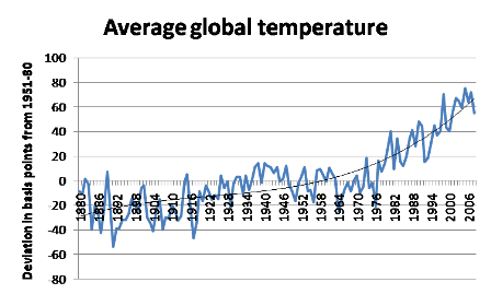
I don't know who generated it first, but Paul Krugman and Brad DeLong (see the top middle of his website) love this chart:

Yikes! That's almost as scary as the monetary base.
But on second thought, notice the axis: deviations in basis points from an average.
I'll rely on the same GISS data (though I'm using the Dec-Nov averages--which I believe real climate scientists prefer--whereas I'm pretty sure Krugman is using Jan-Dec averages) and plot the absolute temperatures:
Average Global Temperature
(Degrees Celsius)

And if you used the only objective scale we have--the Kelvin--the warming would look even less worrisome.
I AM NOT saying that I've just blown up the case for limiting greenhouse gas emissions. What I am saying is that Krugman's chart does a lot of persuasion with its presentation. Another big thing it does (perhaps unintentionally) is obscure the warming of the 1930s, because Krugman kept the x-axis labels at 0 rather than moving them down. So you really can't "see" anything until the big breakout after 1976.
Yikes! That's almost as scary as the monetary base.
But on second thought, notice the axis: deviations in basis points from an average.
I'll rely on the same GISS data (though I'm using the Dec-Nov averages--which I believe real climate scientists prefer--whereas I'm pretty sure Krugman is using Jan-Dec averages) and plot the absolute temperatures:
(Degrees Celsius)

And if you used the only objective scale we have--the Kelvin--the warming would look even less worrisome.
I AM NOT saying that I've just blown up the case for limiting greenhouse gas emissions. What I am saying is that Krugman's chart does a lot of persuasion with its presentation. Another big thing it does (perhaps unintentionally) is obscure the warming of the 1930s, because Krugman kept the x-axis labels at 0 rather than moving them down. So you really can't "see" anything until the big breakout after 1976.
Comments:
My favorite krugmanism of the moment is his blog post about the dishonesty of the wsj opinion section. The scale of the hypocrisy is just amazing.

One thing drives me crazy about the "Average Global Temperature" data, as seen in your second chart. The chart goes back to 1881. Does the greater accuracy in modern temperature measurement account for the minuscule one degree rise? Are there more and more weather stations being added to the data year after year, thus skewing the data towards the new stations since they weren’t represented earlier? Not enough questions are being asked about how the group of data is gathered, how representative it is and whether the “models” can actually predict outcomes. People just assume, because it’s a graph, it must be correct.
Leslie's comment about historical data sets, especially before say 1940, is a good one.
Bob's point about degrees Kelvin is new to me and has got me scratching my head. Is there any chance Bob will provide some descriptive detail to this comment?
(I must note in passing that Svante Arrhenius, the Swedish physicist who first speculated about global warming back around 1900, actually thought the whole process was good and would benefit mankind. He actually looked forward to a warmer world.
Often overlooked, he was also a founding and leading member of the Swedish eugenics movement (along with future Nobel prizewinner Gunnar Myrdal).
This has some interesting connections, when one considers the comparisons made between the current popularity of global warming and the similar vogue for "scientific" eugenics early in the 20th century.
Michael Crichton made the Global Warming / Eugenics comparison some years ago, (See here), but didn't realise there was actually such a direct link.)
# posted by  : July 4, 2009 at 12:31 PM
: July 4, 2009 at 12:31 PM
LeslieF, Chris Horner points out in his _PIG to Global Warming_ book some of the concerns you raise. For example, there was a big spike in "global mean temp" after the Soviet Union collapsed and a bunch of stations in Siberia stopped reporting temps. In theory the various data sets all take these things into account, but it's tricky...
Anon, right now with a Celsius scale, you see temps go up 0.7 degrees against an avg temp (from 1951-1980) of 14 degrees. But why are we picking the freezing point of water as the zero mark? If we used absolute zero, then you'd have the same little squiggles of my graph, but it would be shifted up 273 degrees.
Thus, in terms of the percentage change in random molecular motion (heat), the warming of the 20th century was a little blip.
To repeat, I'm NOT saying I just showed that everything is fine. My point though is that I can come up with a chart that looks a lot less scary than Krugman's chart, and mine would be more "objective" than his.
Bob, normally, I'd applaud you for this criticism of graphs, since I seriously hate when people don't base the y-scale from zero. However, temperature is the one time where that's acceptable, and you do need to chose a near-average baseline such as "deviation from average over years A thru B".
By the way I'm going to nitpick on the thermo:
Thus, in terms of the percentage change in random molecular motion (heat), the warming of the 20th century was a little blip.
No! Temperature means molecular motion per degree of freedom, not just molecular motion.
(I was going to link to the time Paul Birch explained this distinction to you in '02, but figured that would be a going a *bit* too far...)
Where did Bob say temperature in this?
"Thus, in terms of the percentage change in random molecular motion (heat), the warming of the 20th century was a little blip."
"Thus, in terms of the percentage change in random molecular motion (heat), the warming of the 20th century was a little blip."
# posted by : July 4, 2009 at 2:44 PM
: July 4, 2009 at 2:44 PM
Not directly, but he assumed that molecular motion is equivalent to temperature, when it's not.
I guess he's technically right in this case because it's hard, in the context of the earth's atmosphere, for temperature to go up via molecular motions *slowing*, but cramming into fewer degrees of freedom.
I guess he's technically right in this case because it's hard, in the context of the earth's atmosphere, for temperature to go up via molecular motions *slowing*, but cramming into fewer degrees of freedom.
Silas,
Interesting, I didn't know (or I had forgotten, according to your claim which may very well be true) about that subtlety. Is an example of that due to the fact that you can have ice at 0C, then add a little heat to get liquid water at 0C?
But anyway, back to the climate change stuff, I still don't see why you are denying me props. Suppose the warming trend had been only 0.000007C over the 20th century. Surely that would be relevant, right? And yet Krugman could still draw his chart and show that temperatures were shooting upwards?
I.e. I'm asking you why you think with temperature, we shouldn't use an absolute scale.
Bob: exactly right about ice/water. Liquid water has far more degrees of freedom per molecule because it isn't constrained to stay within a lattice like ice is.
As for temperature scales, are you serious? Basing every temperature plot at -273 C (-460 F) would be insane. Everything would look like a blip. Imagine what a plot of the temperatures over the last month would look like. In most contexts a change of 5 degrees C would be noteworthy, but would be invisible on a plot.
The problem with the Krugman plot, if any, is in using fractions of a temperature for the scale, and not setting the baseline to be the average over a longer period.
Silas,
Hang on a second. You're right, it would be ridiculous if in everyday life, we went around quoting the Kelvin scale.
But by the same token, it would be ridiculous if we went around talking about deviations from an average. No, we plot temperatures as an absolute scale (albeit not based on absolute zero).
I imagine you can give me a good defense of Krugman's use of a deviation, I just don't see it yet. Or rather, I don't see what overcomes your presumption for an absolute (and zero-based) y-axis.
But by the same token, it would be ridiculous if we went around talking about deviations from an average. No, we plot temperatures as an absolute scale (albeit not based on absolute zero).[lb]
No, we don't plot temperatures on an absolute scale, in the sense of a "non-arbitrary" scale. Choosing to measure from 0 deg F is just as arbitrary as choosing to measure from 0 deg C or 50 deg F. "Zero" on the Celsius or Fahrenheit scale does not have the same significance that zero does on a distance scale or "number of cars sold" scale. It just happens to be that that is where we chose to measure from, a long time ago, because it happens to give "nice" numbers for most temperatures reported.
So global temperatures could be plotted in Celsius, I suppose, but lay readers don't what "the" average temperature of the earth normally is. Nor is such a term even well-defined; what you call the "average global temperature" depends on what you're using the measurement for.
So it makes perfect sense to plot global temperature in terms of "deviations from an average", which is more useful information than "deviations from an arbitrary baseline" such as 0 deg C.
Note that the measuring posts often where out in the country 120 years ago -- and now many of these posts are surrounded by asphalt and buildings and cars and trucks, etc.
All of that has to be "corrected for" using black magic.
Post a Comment
All of that has to be "corrected for" using black magic.
Subscribe to Post Comments [Atom]
<< Home
Subscribe to Posts [Atom]